
Building a Mobile-friendly Website: Everything you need to know
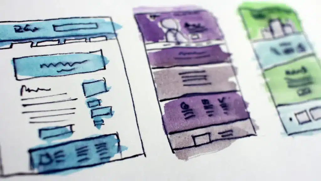
There has been this talk recently about mobile-friendly websites and the benefits that come with them. One of the buzz words off of this talk is the term ‘responsive design’, a term merely referring to a website that auto-adjusts to display perfectly on all modern devices, save for old phones.
You don’t need an outsider or expert to tell you that mobile browsing has surged in leaps and bounds over the past few years, and it’s at its highest at present. In fact, that figure now sits at about half of all web traffic according to independent website observer Statcounter, making your push for a mobile-friendly website a worthwhile endeavour.
Easier said than done though, right? The gnawing problem is how do you make this happen? Where do you get started? What goes into making a site friendly for mobile devices?
To help you in getting these questions answered and determining the best possible approach, we’ve compiled highlights of what you will need to bear in mind, along with best practice guidelines. Keep reading!
Choosing your Approach
Conjuring a mobile-friendly web presence involves several approaches. These are normally divided into three, with each approach providing a different experience for mobile users.
These are:
- Responsive: This approach sees the page remain the same (all elements including the URL, HTML, images et al). The CSS, however, gives different rules based on width of browser.
- Adaptive/RESS/Dynamic Serving: The URL remains the same, with different HTML and CSS being dispatched by the server depending on the type of device requesting the page.
- Separate Mobile Website (no longer recommended): This was normally hosted on a sub-domain of the main site (e.g. mobile.google.com) or other times on a subfolder (e.g.www.google.com/mobile). It can also use the same URL as the main website though, and simply serve different HTML (known as dynamic serving) to mobile and desktop visitors based on user agent.
Don’t forget that choosing the approach is just the start of things. However, this should form the basis upon which you will design, build and optimise your website to be the best possible version for not only users but also the search engines.
Tip: go with responsive. Since Google moved to mobile-first indexing it crawls the mobile version of your site as the primary one, and a single responsive site is the only approach Google still recommends. Separate mobile sites are listed above for context, not as an option worth taking in 2026.
Adjusting your Existing Website for Today’s Web User
With over a billion people primarily using mobile devices to access the Internet, every business – large or small – cannot afford to ignore this chunk. You may not be ready to rebuild your site for optimal display on every device out there, but at least there is one of two steps you can take:
- Simplify your site design: One day take a smartphone and pull up your website – or view it on the PageSpeed Insights – and it is then that the need for design changes may dawn on you. To be able to display well on mobile, aim for simpler page designs that boast larger font sizes, with all the fundamental info placed strategically in view and huge, touchable buttons to combat fat-finger syndrome. Think about including your name, phone number and link to a map at the top-left side of your homepage for easy accessibility.
- Make your existing site responsive: this used to be a choice between editing your site and commissioning a separate mobile version. It is not any more. Since Google moved to mobile-first indexing it crawls the mobile version of your site as the primary one, and running a second mobile site splits your content and your rankings. Google and Bing both vouch for a one-URL approach for purposes of SEO and ‘findability’. However, if you are one of those who can’t afford to rebuild their site, creating a mobile version that links to the main one is not a worse off strategy; ignoring your mobile audience altogether is.
Mobile Design Concerns
Navigation on a Small Screen – instead of showing navigation of the desktop website, mobile navigation options ought to be minimised. Most sites accomplish this with a magnifying glass or the three line method.
Size discrepancies of smartphones – Majority of smartphones display 320px to 400px across in terms of CSS pixels, but the old versions of iPhone are just 240px across and can go up to 640px when flipped on their sides. Tablets, on the other hand, range between 480px and 800px across when held like a book, but when held like a TV – the more likelihood – it stretches their maximum pixels across to 1280.
Basically, what this means is that you have a very wide variance to work with: between 320px and 1280px. It’s difficult to please everyone, and so you need to find out which screen sizes people use on your website. Google Analytics should help you achieve this easily.
Tip: Given each element spans the entire screen size, you can normally set their widths to 100 percent in CSS. As the screen size shifts, they will contract or expand accordingly. Images will automatically shrink too.
Designing for Touch
Here are a few pointers to bear in mind when designing websites for touch screens:
- Provide feedback when the screen it touched to let the user know the device has recorded the tap
- Provide enough space for a finger, and make sure it’s at least 28 x 28 pixels around links present on your site for the clumsy finger
- Redesign drop-down menus that indicate clear separation between options
- Use buttons to define any clickable area well given touch is different from mouse which allows for hovering over the supposed area
- Minimise text input by breaking up your pages with a ‘Next’ button to minimise scrolling
Keep these basics in mind when building a mobile-friendly website and you will never go wrong!
See our web design work: Website Design.